Marketing Podcast with Phil Simon
Visual thinking is one of the more recent trends in business that has now reached into every arena. Organizations are rushing to become more visual. You need look no farther than the popularity of sites like Pinterest and Instagram to realize that people are inherently drawn to pictures.

Marketers have long realized that power of images to help illustrate a point, simplify a concept and evoke an emotion.
Online surfers, particularly younger online surfers, have grown accustomed to scanning pages and sites to quickly assess, in a sea of data, if something merits a more focused bit of attention.
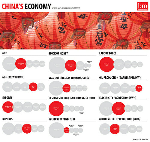
A growing use of this visual trend is the visualization of data. Fueled by massive internal and external data sets organizations are turning to visual aids to help make and communicate meaning through pictures over spreadsheets.
The use of Infographics, as they are often called, loosely created an entire marketing asset category as organizations rushed to create poster-like graphics that tell a story and hopefully go viral.
Today, data visualization has grown up to the point that it’s no longer simply a trendy way to create marketing graphics. Data visualization techniques and data driven organizations are starting to use visualization as a leadership and management tool. (To be fair many organizations have done this for years, it’s just much more accessible in some of the new ways to analyze and communicate.)
As data journalist David McCandless said in this TED talk: “By visualizing information, we turn it into a landscape that you can explore with your eyes, a sort of information map. And when you’re lost in information, an information map is kind of useful.”
My guest for this week’s episode of the Duct Tape Marketing Podcast is Phil Simon. Simon has written six books on management including his most recent – The Visual Organization: Data Visualization, Big Data, and the Quest for Better Decisions.
As we discuss in this interview Amazon is, of course, the poster child for its use of data as a decision making tool. In many cases Amazon can offer next or same day shipping because they have a pretty good idea of who is going to order what and when.
Simon is also quick to point out that “a company with a dysfunctional culture and no sense of innovation can’t save itself via dataviz.” Like many new things that’s a key point. This is a tool and it’s what you do with it that matters.
Many organizations will use new data visualization tools to create pretty dashboards and little else.
Simon points to an example of how Netflix uses data visualization to ask and answer questions. Instead of saying I bet people often do X when then do X, they simply ask as many seemingly odd and random questions of the data and make discoveries that help drive their business in ways that no competitor can.
And that I think is the essence of this new era of visual data – data doesn’t simply replace intuition, it helps make intuition smarter. If you’re open to asking questions and becoming a data scientist you’ll discover things you can’t imagine from numbers on a page.
Here are some data visualization tools worth checking out – Visual.ly, Many Eyes, iCharts, and one from LinkedIn Labs that allows you to view your world connections.

