Keeping your sales pipeline healthy reduces the worry for businesses that they are not receiving enough income. There are trends throughout the year that can affect the pipeline so how do you keep it topped up at a satisfactory level the whole year?
Focus on the Visitor Experience
Your company has put effort into marketing to get your visitors to your site, perhaps through pay per click advertising, sending out email campaigns or having a successful social media presence. Whichever route bought the individual to your website it is now your site that has to wow the visitor.
US companies are now 6% ahead of UK brands in terms of customer experience, compared to 2% ahead last year. The visitor experience is vital for companies to gain custom, loyalty and repeat business, all aspects that help fill the sales pipeline.
How to Improve the Visitor Experience
Your website has many different aspects that affect visitor experience. This includes:
- Landing pages
- Website design
- Mobile responsive
- Contact channels
Each area is a piece of the overall puzzle; any section that frustrates the visitor can ruin the whole image and prevent them from completing business with your company.
Landing Pages
A Landing page needs to encourage a visitor to undergo an action; this is to inspire the visitor to continue to the website or to capture lead information. There are two types of landing pages:
- Click through
- Lead generation
The purpose of the click-through type of the landing page is to increase the company’s conversion rate. It is common for visitors to only view one page; the landing page can pique the visitor’s interest and help move them along for more in-depth information or towards purchasing.
E-commerce sites mainly use the click-through type with the destination page being the shopping cart or registration page; this increases the chance of gaining more conversions than directing a visitor straight from your marketing routes to the destination page.
A Lead generation landing page if designed well can increase your sales pipeline by collecting the visitor’s contact details, allowing you to market to and nurture the prospect.
Visitors are more willing to give their details to companies if they feel they are getting something of value, this could be:
- Ebook or Whitepaper
- Discount Coupon / Voucher
- Free Trial
- A Physical Gift
- Registering for a webinar, product launch updates, consultation, competition entry etc.
Now you have an idea of the types of a landing page and what should be on there, how do you design the page? Wordstream has put together a useful article on “9 Tips on How to Craft an Effective Landing Page” that covers:
- Clean Organised Design
- Be a Minimalist
- Use Header to Broadcast Offer Value
- Trust Signals
- Make your Page Mobile Friendly
- Keep your Form Short
- Tailor your Landing Pages for Individual Audiences
- Match Landing Page with PPC Ads
- Test!
Design
Once the visitor has clicked through to your website, the design of the site is the next hurdle. Information needs to be presented clearly on the page, and not cluttered to fit everything on. Images of products should be a good definition and if there is more than one angle, these should be captured to give the visitor the most accurate representation.

In the example the company above has taken 3 very similar images on the front angle of the dress, many visitors would want to be able to see the back to judge what it would look like on them and if there’s any additional design (zip showing etc.)
Navigation should be kept simple to help the visitor through their journey. Your most popular pages can be identified within Google Analytics to see where your visitors are browsing. Less popular pages can be amended or removed if they have been dormant for a long period of time.
Mobile Responsive
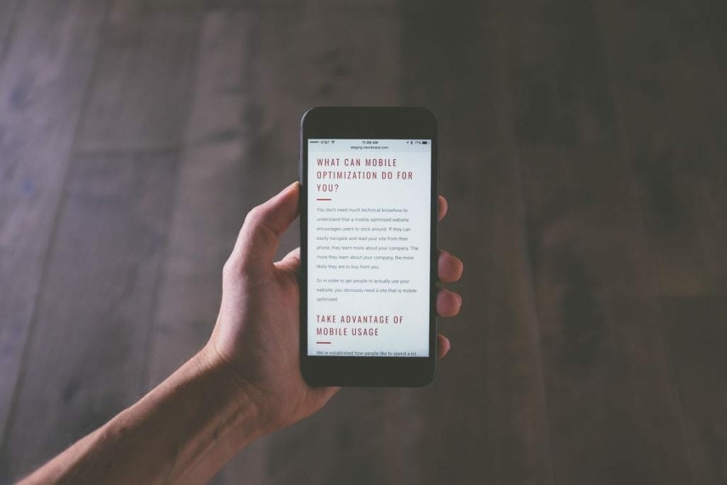
Part of the design aspect is to ensure whatever device the visitor is using, that their browsing experience is effortless.
Firstly Google will punish you if you don’t have a mobile-friendly site, we are not talking about getting completely penalized by Google, however, you will rank lower as they take the user experience very seriously! Losing rank position can affect a number of visitors you receive to your site organically and therefore a number of visitors you gain into your sales pipeline.
Switching to a mobile responsive site and designing it well can improve the visitor’s experience and help them to achieve their goal for visiting your site. Bradley Nice, Design Consultant at Click Help has put together a guide with a helpful infographic on this year’s Best Practices of Responsive Web Design.

Contact Channels
The last piece of the puzzle! The visitor has come to your site and is satisfied with the experience they have had so far. They are moments away from becoming a lead or making that sale but they have a few questions first.
Your representatives need to be contactable to close them. Everyone expects a phone number and an email address or form to be available in an obvious place; however, it can take the visitors attention away from the website.
They could be waiting hours for a response in which time they have researched your competitor’s products and/or services. If they wait too long to be connected by phone, they can become frustrated and it could ruin their entire experience.
The quickest way for them to get their answers is via a web chat system. They are still present on the website when they are connected instantly to a representative who can help them to purchase or gather details from them.
Web chat has the highest satisfaction levels for any customer service channel, with 73% compared with 61% for email and 44% for phone. Web chat works well when operators are attentive to the visitor’s needs, they should aim to answer a new chat within 20 seconds with a welcome message.
Shorter sentences should be used to answer the visitor’s questions as the information can be digested easily. Visitors are not waiting in silence for a response, at least on the phone you can hear the other person making background noises like breathing to know you are still connected.
Conclusion
If the visitor has an effortless experience of your website from the moment they enter and are not faced with any frustrating issues they are more likely to convert, topping up your sales pipeline. There are many platforms and professional service available to help improve the visitor experience, invest smartly in these and your pipeline will be a healthy one.
What changes have you made to your website, did you find they improved the visitor experience? I’d love to hear your experiences in the comments.
If you liked this post, check out our Guide to Customer Relationship Management.
 About the Author
Gemma Baker is the Marketing Executive for UK web chat system provider, Click4Assistance, with a range of digital knowledge within PPC advertising, SEO practices, email campaigns and social media

