When marketers plan their campaigns, the objective is usually to achieve one of two goals: increase brand awareness or maximize conversions. These two styles of marketing work together but they’re distinct from one another.
- Awareness marketing involves establishing a reputation within your niche, differentiating yourself from competitors and bringing people into the top of your funnel. A common awareness marketing tactic would be creating blog content and publishing it using Twitter.
- Conversion marketing is all about encouraging people to perform actions on your website. Split testing your product page, building an email opt-in form and writing persuasive sales copy are all conversion marketing tactics. In other words, conversion marketing pertains to the bottom of your sales funnel.
When you execute your marketing strategy, it’s important to optimize for conversions first. If you initially focus on awareness and start sending traffic to an under-optimized website, you’ll be leaving money on the table.
When you make conversions your priority, your awareness marketing suddenly has a purpose: to turn cold leads into paying customers.
Awareness marketing is crucial for establishing a positive reputation in the marketplace (particularly if you value longevity), but sales are the lifeline of any business. While you need a certain amount of traffic in order to optimize your conversion funnel, awareness cannot be the end goal if you want to survive.
Most marketers understand that businesses thrive or die based on conversions but their daily work isn’t in alignment with this. Therefore, it should come as no surprise that only 22% of businesses are happy with their conversion rates.
Before you start focusing on driving significant amounts of traffic to your site, ensure you have a mechanism in place for conversions.
Here are some of the main ways to build a conversion-friendly website:
Create a Lead Magnet
A lead magnet is something you can give to people for free in exchange for their email address. Common lead magnets include: eBooks, checklists, case studies, mp3 recordings and webinars.
By offering a relevant lead magnet to your visitors, you’ll ensure that a percentage of them move further into your sales funnel by signing up to your email list where you can continue marketing.
Features of a great lead magnet include:
-
- Immediately actionable – Visitors should gain information from your lead magnet that they can quickly put into practice in order to enhance their lives or businesses.
- Solves a legitimate problem – When doing buyer persona research, it’s important to learn about the pain points your customers have. If you can provide a piece of content that solves the problems these people are experiencing, they’ll gladly give you their email address for it.
- Delivered quickly – It’s not a good idea to make people fill out a bunch of forms or wait for a lengthy download. Ensure your lead magnet is delivered (preferably via email) as soon as the person signs up to your list.
- Builds credibility – While the goal of a lead magnet should always be to deliver value to your audience, it’s important that your lead magnet also conveys your expertise. Case studies make excellent lead magnets because you can deliver value while demonstrating that your expertise has helped others too.
Instead of offering one generic lead magnet for all of your visitors, you may achieve better results by thinking contextually.
Examine your best performing blog posts, then think of a way that you can offer a specific lead magnet for visitors to those pages. If you’ve written a blog post about producing visual content on a low budget, including a downloadable resource list of free visual content tools at conclusion of the post will encourage people who’ve read the post to subscribe to your list.
Build Email Opt-in Forms
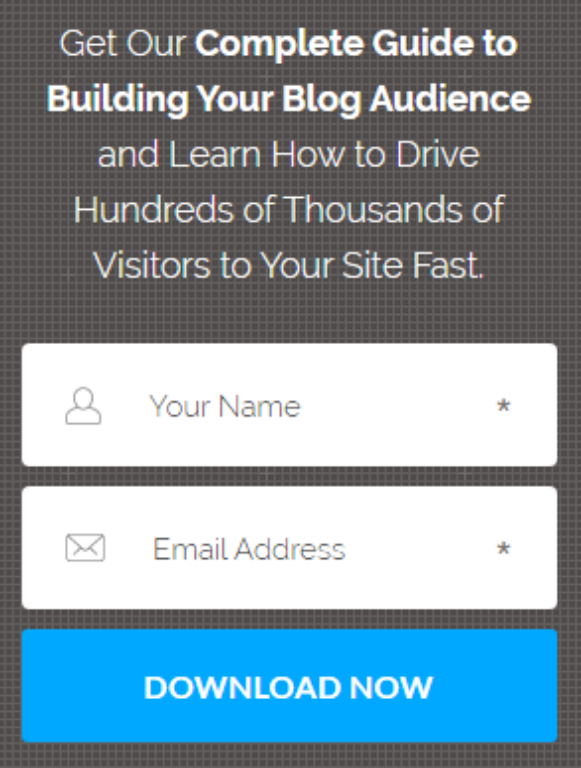
Even if you don’t use lead magnets (why wouldn’t you?), you still need to include email opt-in forms on your site to prevent potential leads from getting away.
Opt-in forms should be conveniently located. Ideally, you should always have an email opt-in form above the fold – so that a person sees your form as soon as they arrive on your site.
Research indicates that users spend 80% of their time looking above the fold, so don’t force them to scroll down in order to sign up to your list.

Additionally, make your form easy to use. Don’t force people to enter a CAPTCHA code or validate their humanity with trivial games.
Only request the minimum amount of information from a person as possible (usually just their name and email address). If you ask too many questions, you run the risk of them getting bored and not subscribing.
Build an Automated Email Sequence
With email marketing tools such as Constant Contact, ConvertKit and MailChimp, you can start building out an automated email sequence to send to new leads.
With email automation in place, new leads will get acquainted with your brand as soon as they’ve signed up to your list – which moves them further through your funnel.
Before displaying your email opt-in forms, I recommend building out these automated emails:
Indoctrination – This is your welcome message. It reminds people why they’ve subscribed to your list and allows you to communicate the values of your brand, as well as your personality.
Engagement – Shortly after you welcome the lead to your list, send them a follow-up email with some high value content. This could be a link to one of your most popular blog posts or a webinar video.
Conversion – Once you’ve sent an engagement email (or several) and the lead has engaged with the content, you can start sending emails that promote relevant products or services.
Re-engagement – Not everyone who signs up to your list will engage with your content. In these cases, it’s good to have a persuasively written, automated email that you can send to people as a reminder of why they signed up to your list in the first place.
Display Social Proof
 When you consider that 70% of people trust consumer opinions posted online, it’s critical to include social proof elements on your website if you’re serious about conversions.
Testimonials, reviews and case studies are all excellent forms of social proof. If you can persuade your best clients to give you video reviews, this will significantly improve your credibility (text reviews are much easier to fake).
Look at HubSpot’s email opt-in page. By mentioning that 300,000 other marketers have already subscribed to the mailing list, this subtly conveys that the content is valuable – and that you should subscribe too.
Implement CTAs
You can have the most aesthetic, easily navigable website in the world, but if you don’t actively request that visitors take the actions you desire – then you won’t receive many conversions.
Calls-to-action (CTAs) can come in many forms, such as: “Read More” buttons, “Add to Cart” buttons and “Sign Up” buttons.
By including emotive language and scarcity in your CTAs, this encourages conversions.
In e-commerce, much has been written about split testing the text, colors and placements of CTA buttons on product pages. For instance, it’s often a good idea to choose an “Add to Cart” button which dramatically contrasts with the branding of your website (if your site features a blue and white color scheme, an orange button will stand out).
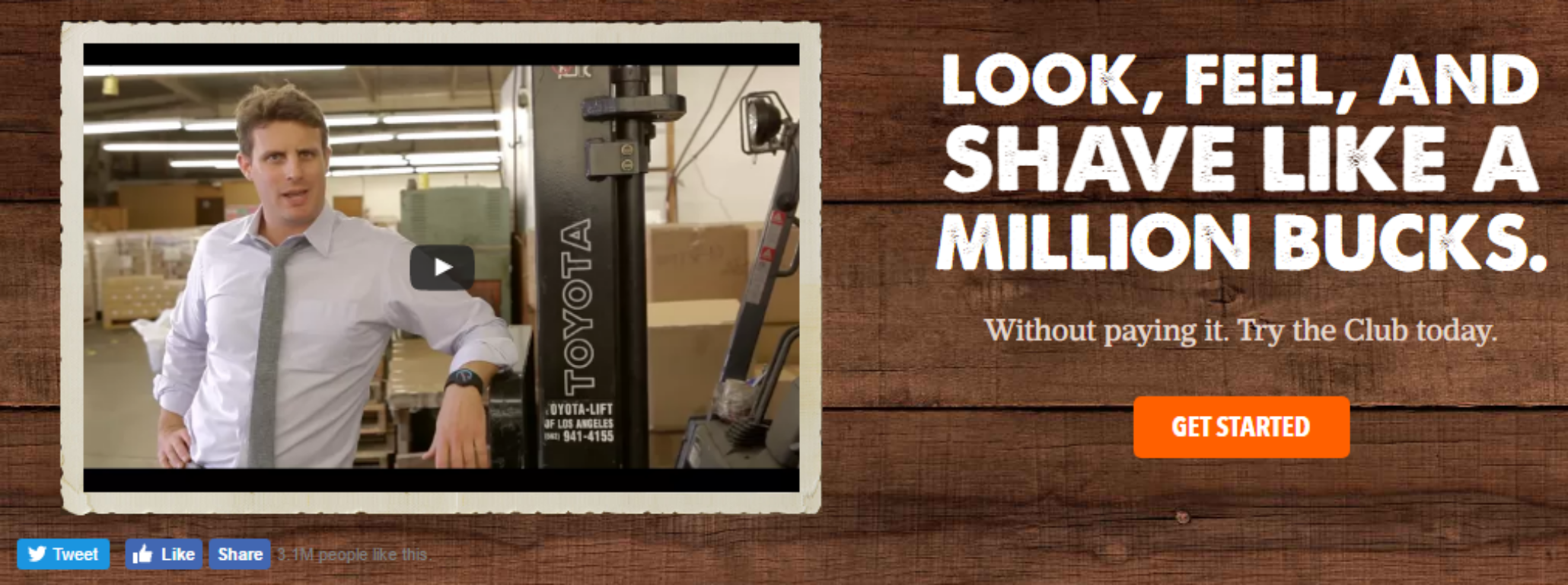
Check out this powerful CTA by Dollar Shave Club that is immediately viewable above the fold:
 Visitors can see that over 3 million people like the brand on social media (huge social proof), you can try the service with no risk and the CTA button dramatically contrasts with the background. Also, you’re not just buying a shaving kit, this product will make you feel like a million bucks – why wouldn’t you hit the “Get Started” button?
Given Dollar Shave Club’s enormous growth in recent years, it’s likely they’ve invested significant funds in split testing this CTA. Since you already know it works, you can use this (and other examples) as inspiration when formulating your own CTAs.
Can you think of any other ways to make your website friendlier for conversions? Please let me know in the comments below.
 About the Author
Aaron Agius is an experienced search, content and social marketer. He has worked with some of the world’s largest and most recognized brands, including Salesforce, Coca-Cola, Target and others, to build their online presence. See more from Aaron at Louder.Online, on Twitter, and LinkedIn.

