Thursday is guest post day here at Duct Tape Marketing and today’s guest is from Terry Costa – Enjoy!
People who conduct searches on a website convert at a higher rate than people who don’t.
So it makes sense to find ways to improve the search on your e-commerce site. There are several ideas for doing this. And the good news is that these ideas – taken from our “Big Book of Site Search Tips,” available at http://getsliebooks.com – don’t demand too much from your IT experts when you’re working with a full-service site search vendor.
Keep all eyes on the search box: The search box should be designed so that it’s different from other forms or boxes on your website’s home page, such as a newsletter subscribe box. Given that site visitors expect to easily find the search box – and given that they may abandon your site if they can’t find it – you should highlight the search box prominently on every webpage. To avoid confusion, in a newsletter-subscribe box, you can add text that reads “Your email,” which tells people that this box is expecting an email address, not a search term. Also, avoid using images that look like a search box, such as text inside a small rectangular box.
Another good way to get people to pay more attention to the search box is to name the button that begins the search process something like “Search,” “Find,” or “Go” – or use an icon such as a magnifying glass, which is clearly recognizable to visitors. Another alternative is to use a triangle that looks like an arrow. Some website owners use a combination of text and an icon – a good strategy, as both clues are clear and recognizable. In fact, the search box for Duct Tape Marketing, seen at the top of this blog, adds both features. Also, you can see here how the shoe retailer Footwear etc. adds text to its search box.
Since we’ve already concluded that people who search convert at a higher rate than people who don’t search, it makes sense to find ways to get people back to your search box again and again. To ensure your search box is always visible to visitors, float it so that it always appears at the top of the page as visitors scroll down. If you go to the website for wedding retailer American Bridal, you can see how this works: as you scroll down the page, the search box and coupon codes are always visible.
Learn to “searchandise” results: You should be able to manually control the order of search results, which is useful when you want to showcase something that’s different from what your search is showing. For instance, you can place sale or promotional items at the top of search results to attract attention.
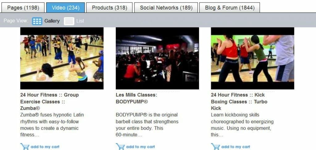
Highlight different content types: It’s becoming more common for websites to add content such as blog posts, community forum posts, and videos to their search results. If you’ve spent time creating this content on your own website, it’s good practice to make this content easily searchable. The health and fitness website for 24 Hour Fitness uses tabs to draw attention to social media content.
Show a “breadcrumb” trail: Breadcrumb trails help visitors keep track of where they’ve come from when they are navigating through your site. A search-oriented breadcrumb trail will show the search term the person used, and any refinements that they have applied to narrow down their search, like color or price options. It makes it easy for visitors to remove refinements and go back to a broader range of results – say, for example, if they think they narrowed down the search too much.
Make the most of search results “cells”: To help people more easily scan search results, organize information into what are called “cells.” Place each result in a thinly outlined box, or in a box with a colored background. If you want to create a more open look and feel, add enough white space between each cell so that people can easily tell the difference between products. If your product images have a colored background, spacing them just a few pixels apart should be enough to provide a natural separation. Search results cells typically contain a product title, product image, price, and a short description.
If your website is product-focused, think about showing larger product images when people mouse over a thumbnail image in search results cells. The reason is that search results pages usually show smaller thumbnail images that make it hard to see the full detail of the product. By adding a large image pop-up when people mouse over results, they can easily examine the close-up details without having to click to the product page.
You can also use “quick view” windows in cells – they help people view more product information without leaving the search page. Add a button that opens a product detail window, which eliminates the need to load the whole product page and saves people time.
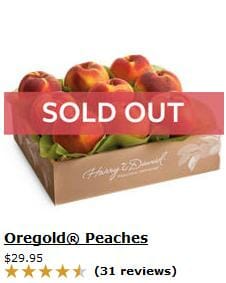
Also, think about adding inventory status to search results cells. People like to know if a product is available before they begin checkout (and it annoys them if they find out they can’t buy something once they’ve set their minds on the purchase). One way to provide current stock or inventory information is to add it to your search results – for instance, including a message such as “In Stock” or “Out of Stock” in the search results cells next to each item, as Harry & David does here with a sold-out item:
If you include inventory status in search results, people can quickly find alternate items if their first choice is out of stock, and they’ll be less frustrated and less likely to leave your site.
Search results pages present great opportunities to promote sales and discounts, since people are usually sensitive to price and interested in chances to save money. Add a special “on sale” logo or banner to the relevant search result cells, place sale items at the top of results, or let people refine results to see what’s on sale.
Another good idea is to show both the full price and the sale price in search results for items that are on sale. If you show shoppers the savings they’re receiving by contrasting regular and sale prices, you give them even more motivation to make a purchase.
Include social sharing buttons: By helping your website visitors share your products and information on their social networks, you broaden the reach of your marketing. Consider including social sharing buttons such as Facebook “Like,” Pinterest “Pin it” and Google+ “+1” in search results. These social endorsements are even more useful for shoppers when they’re shown among a collection of similar products in your search results.
Add infinite scrolling: You may have noticed this feature on social networking sites like Facebook and Twitter – when you get near the end of the page, more posts are loaded automatically, creating an endless scroll. In site search, when users reach the bottom of visible search results, more results are loaded without them having to click on “next” or a page number.
Use synonyms to offer more results: For instance, if a site visitor searches for iPods, and your site offers other MP3 players, connect these and other similar items so that they appear together in search results. This provides shoppers with more alternatives, encouraging them to browse similar products.
Allow people to refine by price: For product searches, as opposed to searches for content like news articles or blog posts, it’s helpful if people can refine results by price, since that’s an important part of many buying decisions. One option to consider is a price slider, which allows people to easily set a bottom price and a top price. It takes up less screen real estate than a list of price ranges, and it offers more flexibility than fixed price ranges.
Monitor keywords that are gaining popularity: Watch the keywords that your visitors are using more often so you’re able to meet increasing product demand. Trends around popular terms may shift with the seasons, or with popular songs and movies. As people use the same search terms with growing frequency, you get advance word, so to speak, that the products that go along with those terms will likely also gain in popularity.
As you make improvements to your website’s search function, keep a close eye on changes in visitor behavior – for instance, more people using search, more people making purchases after conducting searches, or a lower abandon rate. This will tell you that the features you’re adding to your site are actually working.
 Terry Costa is vice president of marketing at SLI Systems (www.sli-systems.com/).


