Since last week’s sweeping changes to Facebook Pages people have been scrambling to unearth all the little tricks that the new format affords.
One of the bigger changes from a look a feel standpoint involves the placement of five recently updated images along the top of the Wall page. The images are now one of the most prominent features of the page and marketers are analyzing ways to take advantage of this new placement. (Personal profiles have had this look for a while now.)

A couple factors come into play when considering a marketing use of this real estate.
1) The images that make the top 5 are the last 5 by default, although if you remove one by hovering over it and click the X the next one in line jumps in. The images are displayed randomly with each refresh of the browser page. (Personal profiles show the images in a static order so some profile owners have gotten very creative with this space.) My guess is that the random display is being used on pages to inhibit the use of this space like a banner ad.
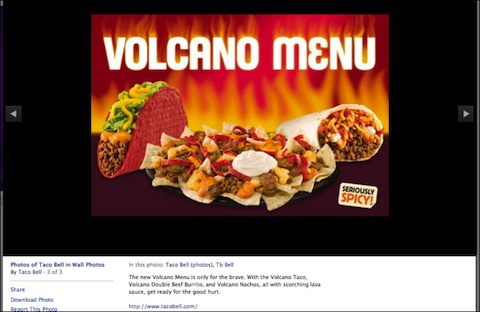
2) When clicked, images now expand into an ajax photo viewer right there on the page, complete with image description and any corresponding conversation about the image from fans. This is a much better user experience, but it also opens the door for some marketing plays.

For the moment (all things with Facebook can change instantly) marketers are starting to use this space as a place to sprinkle in images with marketing calls to action. They then create offers or links to other pages and sites in the image description. You could certainly abuse this, but business pages have a little more leeway in terms of promotional messages and you can expect coupons, infographics, and free report offers to crop up in this space pretty quickly.
Here are a couple examples: (If you’re not a fan of the page you may land on a page other than the wall – click the wall link in left sidebar to see the images.)
- LuckyandCo (reader suggestion update)
- Social Fresh
- Social Media Examiner
- Hubspot
- Taco Bell
The technical aspects of this are pretty simple.
- Create an image that is 970 px x 680 px (or some variation of this 1.42:1 ratio – any other size ratio will cause the image to get cut off in the thumbnail creation – although you might be able to play with this from an artistic standpoint)
- Upload the image through you photo tab
- Facebook automatically creates a thumbnail for the wall.
- After you upload the image you get a chance to describe it with a post. Use this space to make your call to action clickable by adding commentary and a link. (make sure to use http:// so it’s live.)
Your image and associated commentary will go into your news feed so it’s probably wise to go cautiously here and keep the promotion as low key as would be expected by your fans. This is great place to create awareness about content that may reside in other places. I also think you’ll want to keep this area fresh and rotate in new images and events and don’t always use it to sell!

