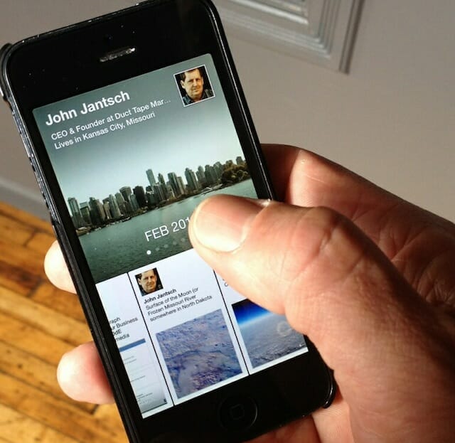
By now you’ve probably at least read about Facebook’s newest app called Paper. If you own an iPhone and live in the US it’s also possible that you’ve downloaded and experienced the new app. (Really silly name and too bad because there’s a totally awesome iPad app already called Paper)
The first thing you must understand is that this is not the new Facebook app, it’s a new way to experience Facebook. The Facebook app remains as do Facebook Messenger and Pages apps. Paper is a decidedly visual way to view your news stream as well as aggregate content from other categorized content areas such as tech and sports.
Flipboard users will recognize the magazine like layout and swipe gesture pros will appreciate the many ways to move and consume content. Probably my favorite element is the “Ken turns” effect that allows you to change the view of a full screen image by tilting the phone this way and that.
I’ve played around with for a day now and I would say I’m mixed. It’s certainly more visually appealing and the content it turns up is very readable, but I don’t know if I need another app for that. Hardcore Facebook users might not like it as the primary way to interact with their friends.
Initial reviews, however, are quite bullish on this new, potentially game changing mobile view of Facebook. but what does it mean to marketers? Well, here’s what seems obvious.
No ads for now
The app launched ad free but something tells me this is the perfect platform for story telling, entertaining ads much like you saw from Bud Light during the Super Bowl with the Llama ad. Start thinking promotions as episodic content.
Long form content on mobile
The layout lends itself to long form content that mobile users seem to be coming around to. Other aggregation apps, particularly iPad based apps, have seen this same thing. Start thinking Mediumesque story lines.
Visual media focus
The app features full screen images with panoramic functionality and auto play video settings. Facebook is clearly signaling that the text only update isn’t welcome. Start designing posts with the image impact first.
Facebook and Google have both experienced their share of misfires in the social mobile space but Facebook may have chalked one up on the positive side with Paper.
Somehow this feels fundamentally shifty and not in the traditional sense of the word. Facebook seems to have decided its best play is to spread and conquer rather than simply try to create the biggest castle and users are responding to the multiple app play.


