You have defined your audience personas, created an editorial calendar and spent hours researching and writing the perfect content for your customers. Now you’re ready to crush it with your content marketing, right? Not quite.
Content marketing is getting increasingly competitive and noisy. In a 2015 survey by the Content Marketing Institute, 77% of marketers reported using content marketing for their strategy. 76% planned to increase their content production in 2016. With so much content fighting for the attention of your audience, marketers need more than just good writing to set themselves apart.
As you plan your content marketing strategy, consider using design and visual storytelling to differentiate your content from the competition.
Why design?
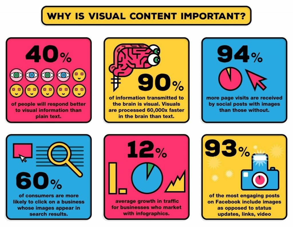
Rather than explain why the visual element of content marketing is so important, let’s try the show, don’t tell method with an infographic:

We are a visual culture. People respond better to visual content and even process information more efficiently when presented in a visual way. With so many performance advantages, it’s clear how design can elevate written content.
With the convincing out of the way, let’s talk about specific ways to introduce design and visual storytelling into your content marketing strategy.
The golden ratio of images

We all know that blog posts need images but are you using enough?
One of the best ways to increase the reach of your content is with the right amount of images. BuzzSumo did the math for us, and found that the right amount of images is one every 75-100 words:
“In a study of over one million articles, BuzzSumo looked at how many blog posts with images were shared. Then they looked at how many images, per how many words, got the best results. What they found was articles with an image once every 75-100 words got double the amount of shares of articles with fewer images.”
Finding images can be tough, especially when you’re adding them every 75-100 words. For some tips on finding good images for your content, check out Pamela Wilson’s guest post on the topic.
Create relevant images

When adding images to your content, you may want to consider creating custom-designed images for your post rather than adding stock photography or memes. An often quoted statistic is that content with relevant images gets 94% more views than content without relevant images, meaning relevance is just as important as quantity when measuring the effectiveness of blog imagery.
If you are considering developing new imagery for your content, it can be helpful to write the content before approaching a designer. A good designer should be able to use the content to quickly understand your design needs and provide relevant, original imagery for your blog. Crowdsourced design from a service like crowdSPRING is especially helpful for projects like this because you can see how your blog post inspires the designs of many different creatives and pick the style most suited to you and your audience.
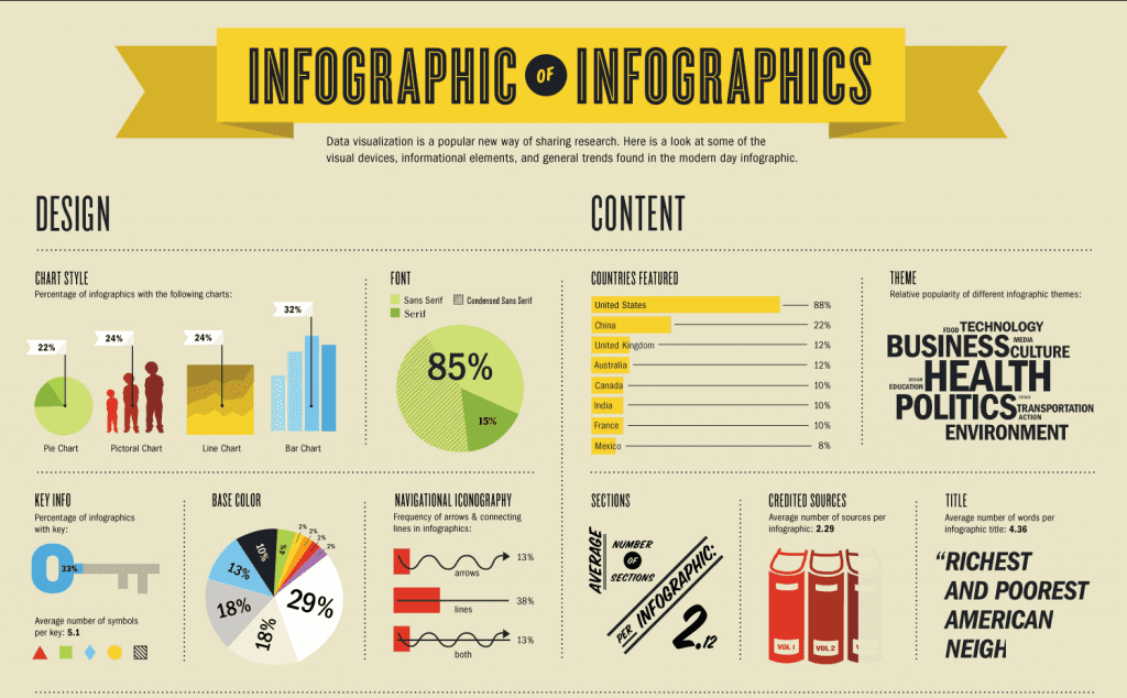
Visual storytelling though infographics

Infographics are a popular form of content marketing because they take the substance of a good blog post or case study and compress the content into something significantly more shareable. Social media tool Mass Planner reports that infographics are liked and shared 3 times more than any other content on social media.
I have written about how successful an infographic can be for businesses, but don’t just take my word for it. Neil Patel, co- founder of KISSmetrics and Quick Sprout, used infographics on the KISSmetrics blog to generate over 2.5 million visitors in 2010 and continues to believe in the power of infographics.
“I can say with conviction that infographic publishing has been one of my most powerful marketing strategies.”– Neil Patel, QuickSprout Founder
Though you can create entirely original content, one of the most efficient ways to start using infographics for your content marketing strategy is to repurpose existing blog posts. Many companies have repurposed their best blog posts into infographics with great success. Buffer turned them “How to Create a Social Media Marketing Strategy From Scratch” post into an infographic during their “no new content” month (more on that here) and continues to use portions the infographic for their email courses.
With the content already outlined in the existing blog post, the bulk of the work is in the hands of your designer who can immediately get to work on communicating the information visually.
Increase shares with social media images

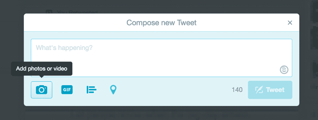
Not every post can be turned into an infographic. For a similar boost in shareability, you can create social media images to promote your content. After reviewing the engagement habits of their entire user base, Buffer reported that tweets with images received 150% more retweets than tweets without images.
Reposting the same featured image from your blog post with a link to your content can get old for your audience, fast. To avoid this, you can create a series of distinct social-only images for each one of your blog posts. These unique images will allow you to re-share your content multiple times without the fear of repetition for your audience. As a bonus, the variety of images will help you test kind of imagery your audience is most receptive to.
Some effective forms of original social media images are quotes, how-to’s, and screen grabs. Each of these can benefit your audience in different ways and depend on the content of your blog:
- Quotes: Twitter reports that tweets with quotes get a 19% boost in retweets, so why not sneak a quote from your post into an image?
- Visual step-by-steps: If your post is a guide, consider illustrating the steps in a step-by-step image. This gives the audience an overview of what to expect in the post while encouraging them to dive deeper by clicking the link.
- Screengrabs: A screengrab of the blog post itself allows you to display content from the post in a different format and offers a “sneak peek” into the best part of a post.
Most social media images can be created with online image editors and a little design know-how. Canva and Pablo are two favorites among marketers. If your eye for design is lacking, consider using a professional designer to make sure your social media images reflect the same quality as your written content.
Start sharing

Enhanced with good design and visual storytelling, your content is now ready to be shared. We’ve already discussed how visuals improve the performance of the content on Twitter and Facebook, but there is one last advantage to adding good design to your content strategy: more distribution channels.
Platforms like Tumblr and Pinterest are visual-centric, and your newly created visual elements can now be shared on those platforms to allow you to connect with an entirely new audience for the first time.
When sharing your content, remember to take a look at how different visual assets perform to help prioritize your visual content marketing efforts in the future. Social metrics like shares and link clicks and web metrics like new visitors will give you a better idea of what visuals contributed the most value to your content strategy.
Consistent use of good design and visual storytelling will differentiate your content, help you communicate more efficiently, and ultimately put your content in front of more potential customers. It is a crucial element of an effective content strategy that cannot be ignored by marketers.
About the Author
 Nick Bowersox is the Marketing Manager at crowdSPRING, the world’s #1 marketplace for logos, graphic design, and naming. Buyers who need professional design pick a category, name their price and tell creatives what they need. Once posted, creatives submit actual work and buyers select their favorite from an average of 100+ entries per project. crowdSPRING has helped tens of thousands of small businesses meet their creative needs. You can read more of Nick’s work on the crowdSPRING Blog and follow crowdSPRING on social @crowdspring.

