Towards the end of 2008, YouTube announced a change to the aspect ratio of the default player for the site. The standard ratio for online video had been 4:3, but the new player standard is now 16:9. Aspect ratio is simply an expression of the relationship of height to width. Something that is 4 to 3 might be 4 inches wide and 3 inches high, and if it is shown on a screen that is 40 inches wide it will be 30 inches high.
Google opted for the new 16:9 format because it had become the universal standard for HDTV and the ensuing onslaught of wide screen HD monitors. As it turns out, most large plasma TVs and even smaller personal viewing devices such as laptops, iPads, and smart phones are set-up to view the 16:9 ratio more fully than the older standard. The standard computer monitor used the 800 x 600 (or 4:3) ratio but most laptops use the 1280 x 720 (or 16:9) resolution for viewing.
Virtually all modern still and video cameras have the wide screen format as a setting or as the default factory set-up.
Over the last year or so I’ve noticed a trend in the world of presentations. I have been asked on more than one occasion to submit my slides to a conference where I was speaking in the 16:9 format. Larger conferences in particular are finding the wider screen works better in very large rooms and commonly employ supplemental monitors around the room or conference that are often wide plasma screens.

Previous standard 4:3 image ratio

Universal HD 16:9 widescreen image ratio
I have moved to creating all of my presentations in this wider format and I think it’s something you should consider as well. Remember, it’s a ratio of width to height, not an issue of overall size. You still have as much slide to work with, it’s just much wider than tall.
Here are a couple reason I like this format:
- It just looks more with the times – I know that may not feel like a solid business reason for altering your presentations, but it does make them look more like what people are coming to expect in viewing
- The wider format allows me to present more white space on already sparse slides. I love that I have more canvas for more impact
- The less tall format seems to work better in smaller presenting rooms where a ceiling might be lower
- It is much easier to insert full screen video and images into slides that use this wide screen format
- The presentations look better when viewed on phones and other players
- Recorded presentations from online seminars archive and look much better when uploaded to sites such as YouTube
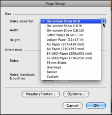
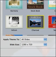
Changing the aspect ratio of your slides in PowerPoint or Keynote is very simple. You choose page set-up in PowerPoint and change to 16:9 and select 1280 x 720 in Keynote.


Changing PowerPoint and Keynote Aspect Ratio
If you are converting presentations that are in 4:3 you’ll have to do some tweaking as the programs will simply stretch your images and other elements. You may need to resize and realign elements, but with this much wider working space you’ll probably want to start from scratch anyway.

